CSS3
边框
圆角
border-radius 可以指定背景颜色、边框、背景图片的元素圆角
px 值越大越夸张
1
2
3
4
5
| #example {
border: 2px solid red;
padding: 10px;
border-radius: 50px 20px;
}
|
每个圆角
- 四个值: 第一个值为左上角,第二个值为右上角,第三个值为右下角,第四个值为左下角。
- 三个值: 第一个值为左上角, 第二个值为右上角和左下角,第三个值为右下角
- 两个值: 第一个值为左上角与右下角,第二个值为右上角与左下角
- 一个值: 四个圆角值相同
- 左上角的弧度:
border-top-left-radius
- 右上角的弧度:
border-top-right-radius
- 右下角的弧度:
border-bottom-right-radius
- 左下角的弧度:
border-bottom-left-radius
盒阴影
box-shadow
1
| box-shadow: 10px 10px 5px #888888;
|
过渡
CSS3 过渡是元素从一种样式逐渐改变为另一种的效果。
要实现这一点,必须在transition里规定两项内容:
指定要添加效果的CSS属性
指定效果的持续时间。
transition: width 2s, height 2s, background 2s, transform 2s;
举例:
1
2
3
4
5
6
7
8
9
10
11
12
13
14
15
16
17
18
19
20
21
22
23
24
25
26
27
28
29
| <!DOCTYPE html>
<html>
<head>
<meta charset="utf-8" />
<title>菜鸟教程(runoob.com)</title>
<style>
div {
width: 100px;
height: 100px;
background: red;
-webkit-transition: width 2s, height 2s, -webkit-transform 2s;
transition: width 2s, height 2s, background 2s, transform 2s;
}
div:hover {
width: 200px;
height: 200px;
background: green;
-webkit-transform: rotate(180deg);
transform: rotate(180deg);
}
</style>
</head>
<body>
<p><b>注意:</b>该实例无法在 Internet Explorer 9 及更早 IE 版本上工作。</p>
<div>鼠标移动到 div 元素上,查看过渡效果。</div>
</body>
</html>
|
图片 Modal(模态)
用 CSS 来创建 modal 窗口 (对话框), 默认是隐藏的
用 JavaScript 来显示模态窗口,当我们点击图片时,图片会在弹出的窗口中显示
如果元素有{display: none;}的样式的话,标签上的图片会被请求加载,但是不会被渲染
1
2
3
4
5
6
7
8
9
10
11
12
13
14
15
16
17
18
19
20
21
22
23
24
25
26
27
28
29
30
31
32
33
34
35
36
37
38
39
40
41
42
43
44
45
46
47
48
49
50
51
52
53
54
55
56
57
58
59
60
61
62
63
64
65
66
67
68
69
70
71
72
73
74
75
76
77
78
79
80
81
82
83
84
85
86
87
88
89
90
91
92
93
94
95
96
97
98
99
100
101
102
103
104
105
106
107
108
109
110
111
112
113
114
115
116
117
118
119
120
121
122
123
124
125
126
127
128
129
130
131
132
133
134
| <!DOCTYPE html>
<html>
<head>
<meta charset="utf-8">
<title>菜鸟教程(runoob.com)</title>
<style>
#myImg {
border-radius: 5px;
cursor: pointer;
transition: 0.3s;
}
#myImg:hover {opacity: 0.7;}
.modal {
display: none;
position: fixed;
z-index: 1;
padding-top: 100px;
left: 0;
top: 0;
width: 100%;
height: 100%;
overflow: auto;
background-color: rgb(0,0,0);
background-color: rgba(0,0,0,0.9);
}
.modal-content {
margin: auto;
display: block;
width: 80%;
max-width: 700px;
}
#caption {
margin: auto;
display: block;
width: 80%;
max-width: 700px;
text-align: center;
color: #ccc;
padding: 10px 0;
height: 150px;
}
.modal-content, #caption {
-webkit-animation-name: zoom;
-webkit-animation-duration: 0.6s;
animation-name: zoom;
animation-duration: 0.6s;
}
@-webkit-keyframes zoom {
from {-webkit-transform: scale(0)}
to {-webkit-transform: scale(1)}
}
@keyframes zoom {
from {transform: scale(0.1)}
to {transform: scale(1)}
}
.close {
position: absolute;
top: 15px;
right: 35px;
color: #f1f1f1;
font-size: 40px;
font-weight: bold;
transition: 0.3s;
}
.close:hover,
.close:focus {
color: #bbb;
text-decoration: none;
cursor: pointer;
}
@media only screen and (max-width: 700px){
.modal-content {
width: 100%;
}
}
</style>
</head>
<body>
<h2>图片模态框</h2>
<p>本实例演示了如何结合 CSS 和 JavaScript 来一起渲染图片。</p><p>
首先,我们使用 CSS 来创建 modal 窗口 (对话框), 默认是隐藏的。<p>
<p>然后,我们使用 JavaScript 来显示模态窗口,当我们点击图片时,图片会在弹出的窗口中显示:</p>
<img id="myImg" src="http://www.runoob.com/wp-content/uploads/2016/04/img_lights.jpg" alt="Northern Lights, Norway" width="300" height="200">
<div id="myModal" class="modal">
<span class="close">×</span>
<img class="modal-content" id="img01">
<div id="caption"></div>
</div>
<script>
var modal = document.getElementById('myModal');
var img = document.getElementById('myImg');
var modalImg = document.getElementById("img01");
var captionText = document.getElementById("caption");
img.onclick = function(){
modal.style.display = "block";
modalImg.src = this.src;
modalImg.alt = this.alt;
captionText.innerHTML = this.alt;
}
var span = document.getElementsByClassName("close")[0];
span.onclick = function() {
modal.style.display = "none";
}
</script>
</body>
</html>
|
分页
1
2
3
4
5
6
7
8
9
10
11
12
13
14
15
16
17
18
19
20
21
22
23
24
25
26
27
28
29
30
31
32
33
34
35
36
37
38
39
40
41
42
43
44
45
46
47
48
| <!DOCTYPE html>
<html>
<head>
<meta charset="utf-8">
<title>菜鸟教程(runoob.com)</title>
<style>
ul.pagination {
display: inline-block;
padding: 0;
margin: 0;
}
ul.pagination li {display: inline;}
ul.pagination li a {
color: black;
float: left;
padding: 8px 16px;
text-decoration: none;
border-radius: 5px;
}
ul.pagination li a.active {
background-color: #4CAF50;
color: white;
border-radius: 5px;
}
ul.pagination li a:hover:not(.active) {background-color: #ddd;}
</style>
</head>
<body>
<h2>圆角样式</h2>
<ul class="pagination">
<li><a href="#">«</a></li>
<li><a href="#">1</a></li>
<li><a class="active" href="#">2</a></li>
<li><a href="#">3</a></li>
<li><a href="#">4</a></li>
<li><a href="#">5</a></li>
<li><a href="#">6</a></li>
<li><a href="#">7</a></li>
<li><a href="#">»</a></li>
</ul>
</body>
</html>
|
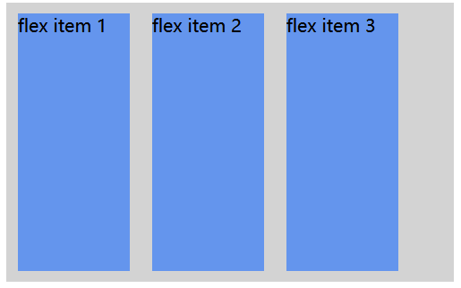
弹性盒子flex
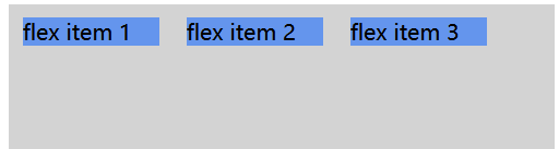
弹性子元素通常在弹性盒子内一行显示。默认情况每个容器只有一行。
direction
direction 属性为 rtl (sright-to-left),弹性子元素的排列方式也会改变,页面布局也跟着改变
1
2
3
4
5
6
7
8
9
10
11
12
13
14
15
16
17
18
19
20
21
22
23
24
25
26
27
28
29
30
31
32
33
34
35
36
| <!DOCTYPE html>
<html>
<head>
<meta charset="utf-8">
<title>菜鸟教程(runoob.com)</title>
<style>
body {
direction: rtl;
}
.flex-container {
display: -webkit-flex;
display: flex;
width: 400px;
height: 250px;
background-color: lightgrey;
}
.flex-item {
background-color: cornflowerblue;
width: 100px;
height: 100px;
margin: 10px;
}
</style>
</head>
<body>
<div class="flex-container">
<div class="flex-item">flex item 1</div>
<div class="flex-item">flex item 2</div>
<div class="flex-item">flex item 3</div>
</div>
</body>
</html>
|
flex-direction
flex-direction 属性指定了弹性子元素在父容器中的位置。
flex-direction的值有:
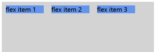
- row:横向从左到右排列(左对齐),默认的排列方式。
- row-reverse:反转横向排列(右对齐,从后往前排,最后一项排在最前面。
- column:纵向排列。
- column-reverse:反转纵向排列,从后往前排,最后一项排在最上面。
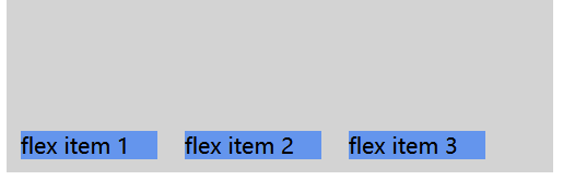
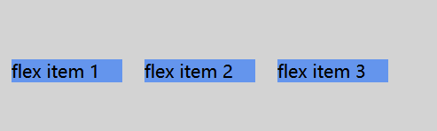
justify-content
- flex-start:
弹性项目向行头紧挨着填充。这个是默认值。
- flex-end:
弹性项目向行尾紧挨着填充。
- center:
弹性项目居中紧挨着填充。(如果剩余的自由空间是负的,则弹性项目将在两个方向上同时溢出)。
- space-between:
弹性项目平均分布在该行上。如果剩余空间为负或者只有一个弹性项,则该值等同于flex-start。
- space-around:
弹性项目平均分布在该行上,两边留有一半的间隔空间。如果剩余空间为负或者只有一个弹性项,则该值等同于center。
align-items
图片
- flex-start:
弹性盒子元素的侧轴(纵轴)起始位置的边界紧靠住该行的侧轴起始边界。
- flex-end:
弹性盒子元素的侧轴(纵轴)起始位置的边界紧靠住该行的侧轴结束边界。
- center:
弹性盒子元素在该行的侧轴(纵轴)上居中放置。(如果该行的尺寸小于弹性盒子元素的尺寸,则会向两个方向溢出相同的长度)。
- baseline:
如弹性盒子元素的行内轴与侧轴为同一条,则该值与’flex-start’等效。其它情况下,该值将参与基线对齐。
- stretch:
如果指定侧轴大小的属性值为’auto’,则其值会使项目的边距盒的尺寸尽可能接近所在行的尺寸,但同时会遵照’min/max-width/height’属性的限制。
网格布局grid
